From 30 Clicks to 3: Redesigning Hospital Interfaces for Speed and Sanity

The Introduction: You may be tired of reading about how digital-age fatigue has overtaken our lives in health care.
At a time when we should be simplifying processes through technology, many hospital systems have instead become complicated and frustrating. Healthcare professionals, whose primary role is patient care, often find themselves saddled with unintuitive and bloated user interfaces (UIs). Whether using a hospital information system or electronic health record (EHR), most physicians must wade through a morass of menus, tabs, and forms. The user experience for an average user can be summed up as 30 clicks just to complete a task he/she does regularly, which is not only time-consuming but adds to cognitive overload, making the users burnout.
In this blog post, we explore the potential of redesigning hospital interfaces into a human-centered design—moving us from 30 clicks to 3, and restoring speed, sanity, and satisfaction for healthcare professionals, with the end result being higher quality of patient care.
The Reality: Design as a Bottleneck
Overall, much of the functionality of the hospital systems was designed without considering how people use these systems. When healthcare operations changed, these systems became bloated with more tabs, more add-ons and third-party plugins. Common complaints include:
– Too many clicks to see basic patient information
– Dispersed workflows across multiple screens
– Bad visual hierarchy which is hard to focus on
– Repetitive data entry and redundant forms
– No personalization or role-based customization
For instance, even something as simple as ordering a lab test or accessing patient vitals can take several windows and some ping-ponging in the navigation. These inefficiencies may appear small when considered in isolation, but accumulate into lost hours over the course of a shift.
The Cost: Burnout, Mistakes and Delays
Clunky interfaces are not just a nuisance—they are a structural problem with tangible consequences in the real world:
– Clinician Burnout: Time with clunky systems rather than patients. As time progresses, this disconnect breeds job dissatisfaction and emotional fatigue.
– Medical Errors: Very complex workflows with too many clicks, leading to misclicks or missing information—a serious threat to patient safety.
– Slower Patient Flow: Bottlenecks caused by administrative tiresome processes slow down everything from admission to discharge, resulting in inefficiencies that trickle through the hospital.
– Training Time: New personnel take longer to become familiar with systems that are not intuitively designed, adding tens of hours to onboarding time and increasing costs.
The Way Forward: Design Styles Focused on Human Faces
To go from 30 clickers to 3 clickers, hospitals need to pivot from a feature-first to a user-first mindset. That’s where human-centered design comes into play.
What is Human-Centered Design?
This means developing the design of digital tools based upon how users—doctors, nurses, technicians and administrative staff—actually work, what they really need, and how they behave. Software is not forced on users to adapt to; rather, software is shaped to conform to and fit users.
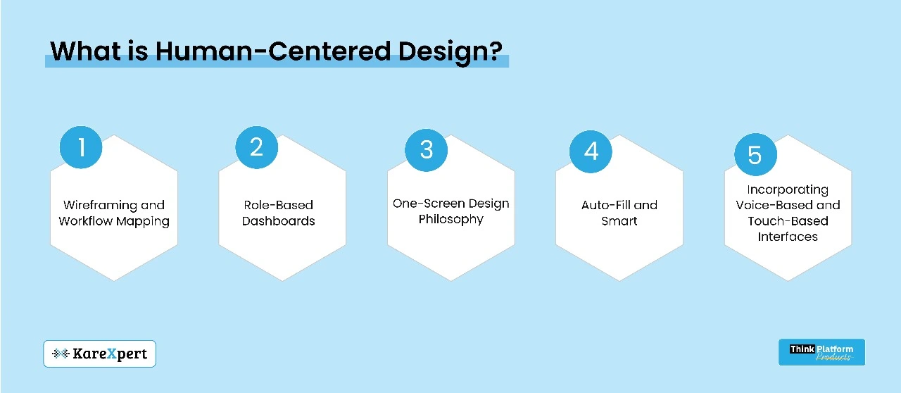
The Pillars of Redesign
– Wireframing and Workflow Mapping We redesign away from the screen, first on paper. Teams must observe and record real-life user journeys. What does a nurse do to give medication? What do clinicians specifically do when they update patient charts? The mapped workflows help show friction points that need to be simplified.
– Role-Based Dashboards Every user has a different type of need. A radiologist might not need the same interface as a receptionist. With personalized dashboards, a user only sees what matters, limiting information overload.
– One-Screen Design Philosophy Avoid multi-tabbed navigation whenever possible. Bring all the important actions into one screen with clear CTAs (Call to Actions). An EMR page for a patient, for example, should summarize the patient’s history, vitals and orders without multiple page loads.
– Auto-Fill and Smart Defaults Data entry prediction, template notes, and AI-powered suggestions can help reduce data entry by 70%. Systems should learn from and accommodate user behavior and frequently used entries.
– Incorporating Voice-Based and Touch-Based Interfaces As wearable devices and smart stations become the new norm, designing for voice and touch saves time spent typing or clicking.
A Case Study of Interface Redesign in a Multispecialty Hospital
Interface redesign project in a multispecialty hospital sheltering emergency, outpatient and pharmacy departments. The goal was to reduce unnecessary steps in the process and enhance time-to-decision.
The Outcome:
– Lab test order time decreased from 42 clicks to 5.
– Multi-character drug selection reduced from an average of 11 screens to 1.
– Reduced time taken for patient discharge by 50%.
The response from health care workers was overwhelming: they had more time to spend in front of patients and less in front of the screen. Satisfaction rates increased, and administrative mistakes were reduced.
Resistance and Change Management
Without proper change management, even the best-designed systems will fail. New UI has an inherent propensity for opposition, most often due to the fear of learning curves. Hospitals must:
– Acknowledge end-users during the testing process
– Give sandbox environments to experiment with the new UI
– Make every rollout a phased one and have feedback loops in place all the time
A Business Case for Optimizing Your Interface
The argument for UI redesign is also a strong one operationally, in addition to clinical outcomes:
– Shortened training period for entry-level staff
– Lower ticket volume because of intuitive navigation
– Increased throughput in outpatient and emergency departments
– Improved adherence to digital documentation mandates
Both these advantages result in cost efficiency and an increase in hospital brand equity.
The Future of UI Design Trends in Hospitals
Contextual Interfaces: Systems that adapt depending on time of day, role, or division.
– Micro-Interactions: Simple visual confirmations of actions, building user trust.
– Dark Mode and Accessibility Improvements: To minimize eye fatigue and create more inclusive systems.
– Low-Code Customization: Giving hospital IT teams the ability to customize individual UI components without full coding activities.
Final Thoughts: The Promise of Thoughtful Simplicity
Cutting from 30 clicks to 3 isn’t just about saving time—it’s about returning attention to where it belongs: at the bedside. As hospitals increasingly move to digitization, usability must not be an afterthought. Interfaces are not screens—they are the connection points for clinicians and the care they provide.
The more intuitive that bridge, the safer and more efficient the trip. As hospitals take on design thinking, employ modern UI technologies and listen to their constituency, they can convert digital fatigue into digital empowerment.
It’s time for healthcare systems not only to be smarter—but also to feel simpler.